By Aidan Ishii, Sherry Ma, Sissi Wu and Miranda Xu
What is design? Who defines, creates, and creates design?
As one of the groups to set up the “Design in Questions” installation, we were assigned to read “Designing Design,” “Graphic Design: Now in Production,” and “What does it mean to decolonize design?” and attempted to question our concerns towards design procedure. Each of us came up with 25 questions and a mind map towards the readings.

Miranda:
Based on the readings and my current design experience, I came up with 25 questions related to the influence of audience reaction in the design process/ final product and the importance of diversity in design. For the mood board and mind map, I focus more on the interactive exhibition and question the importance of audience engagement in the design process.
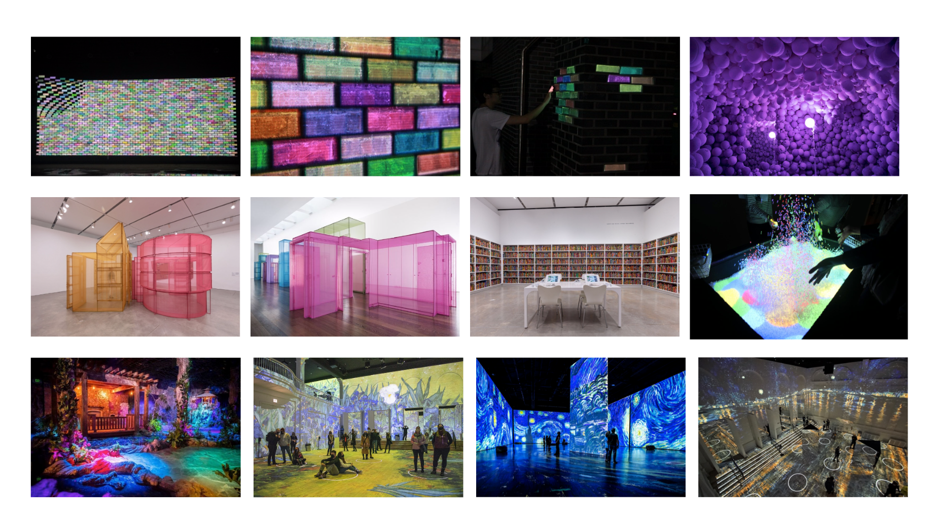


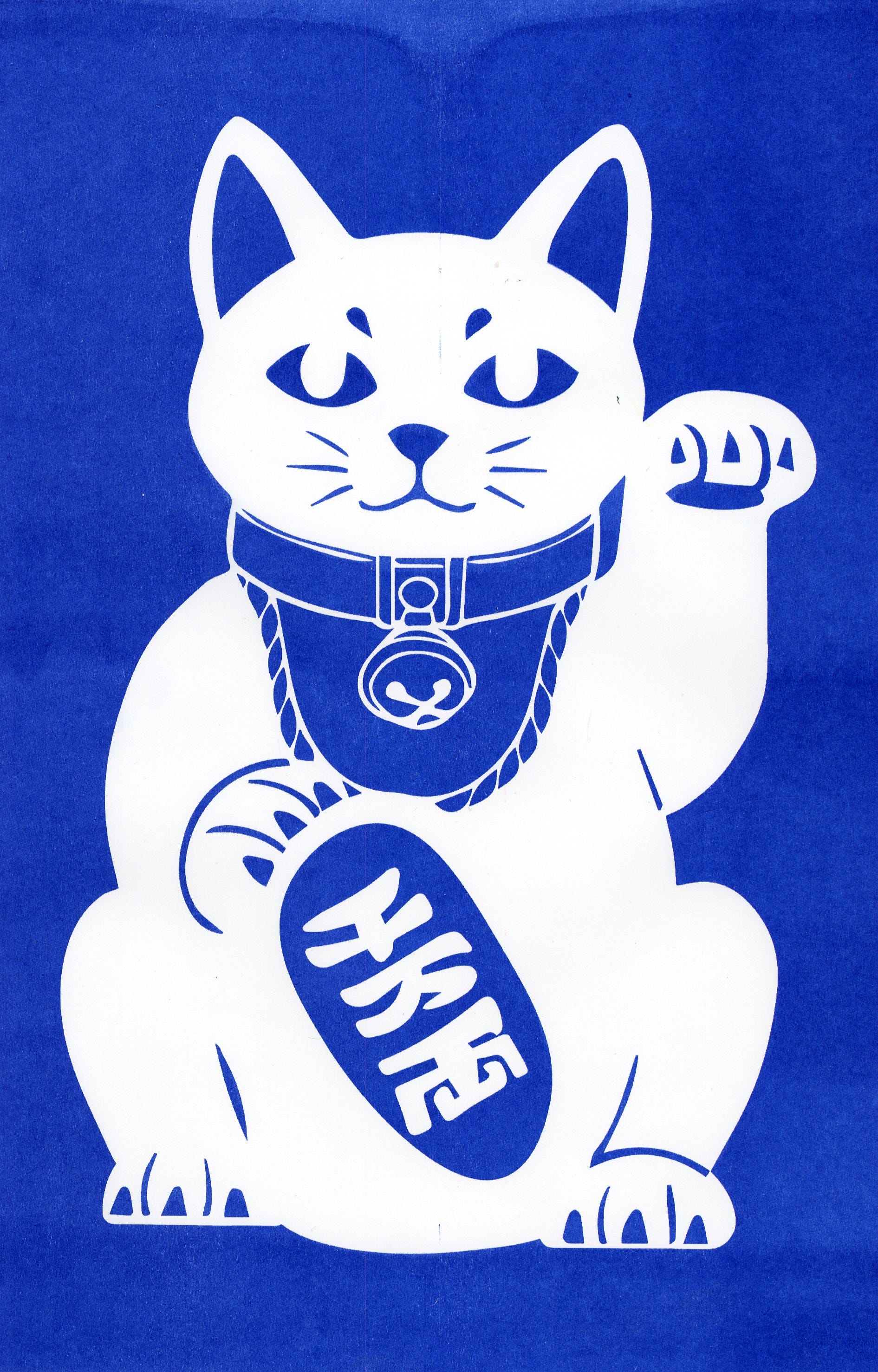
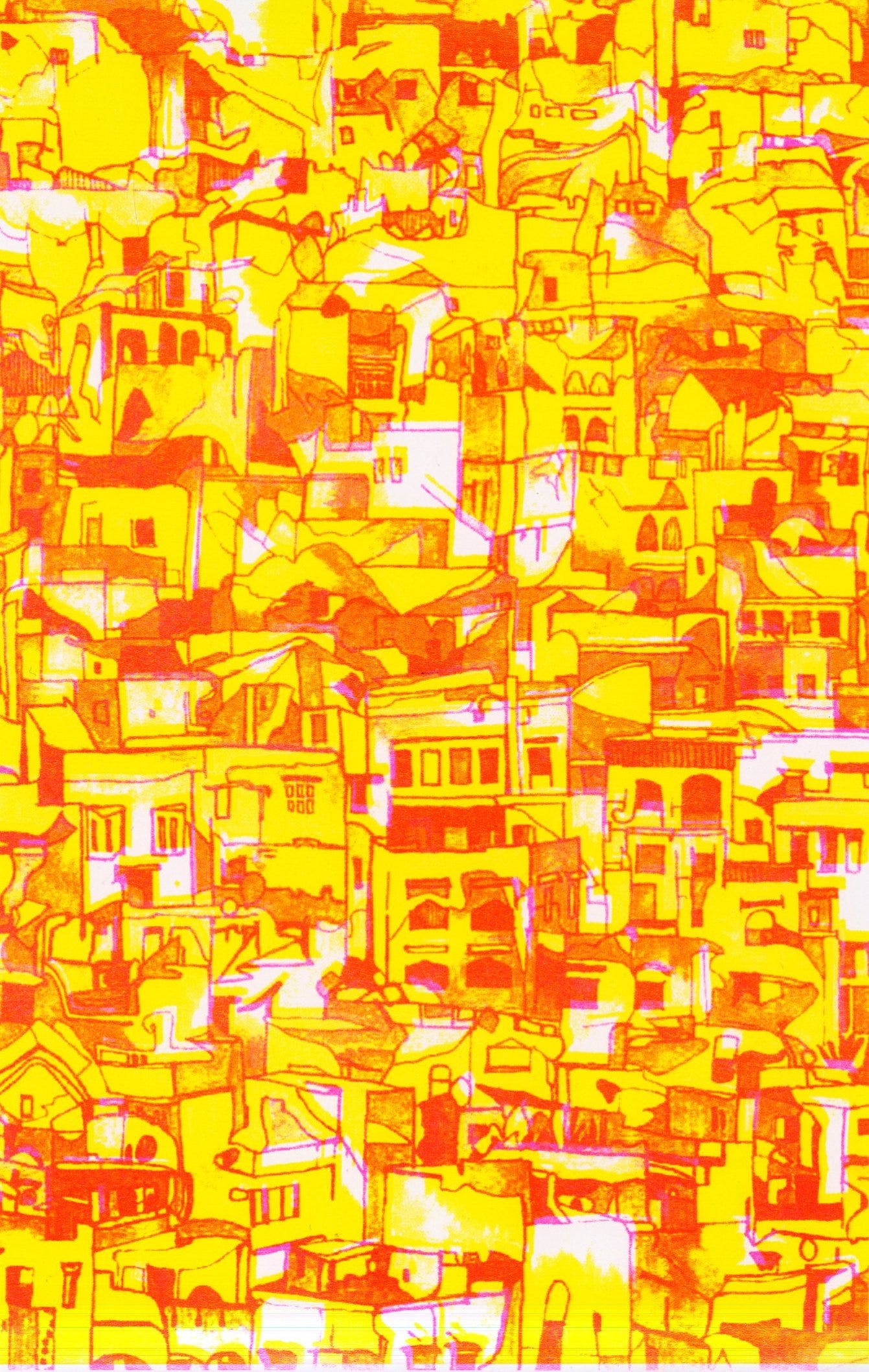
Looking at the diverse form of design, I created 25 posters focusing on the topic include: diversity, audience reaction, and design thinking. For the poster design, I used abstract line worlds and shapes to illustrate my ideas and raise the question of design?




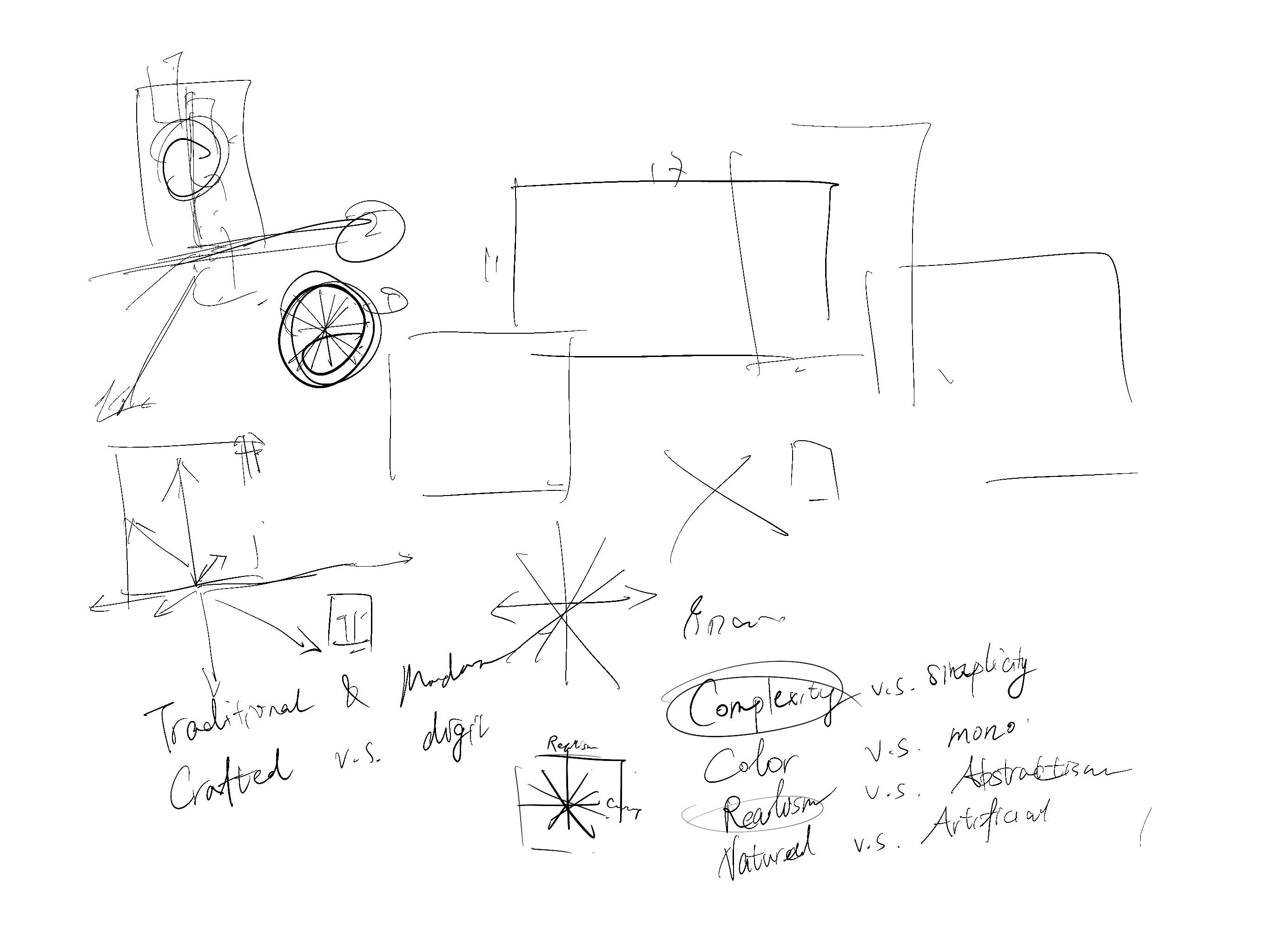
Our team then comes together to explore a common topic from our research and design. We noticed that most of our design touched the question of “what is design” and “who defines design”. Considering our diverse ideas and thoughts, we decided to build a coordinate system with four pairs of terms to describe the design. With the coordinate system, we aim our installation to exhibit our different design interpretations and emphasize the importance of diversity in design.


Sherry:
After finishing readings, I aimed at questioning on the value and criterion of art, and how does the standard change due to the development of techniques and the change of time. What is attractive to me is how the change of materials provides more chances for larger ranges of people to attend in the creation of artworks. Also, how do both artist and audience evaluate the effectiveness and meanings of artworks from different perspectives.


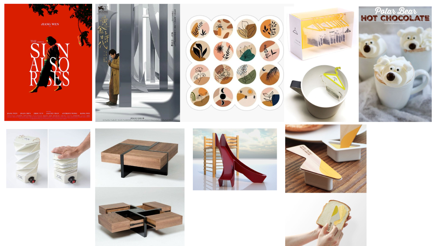
Based on these ideas, I developed 25 drafts mainly focusing on the function of design and the interpretation of art. I was inspired by some “useless design”, which implied to me how a design owned its function, and what we could do to destroy its function.

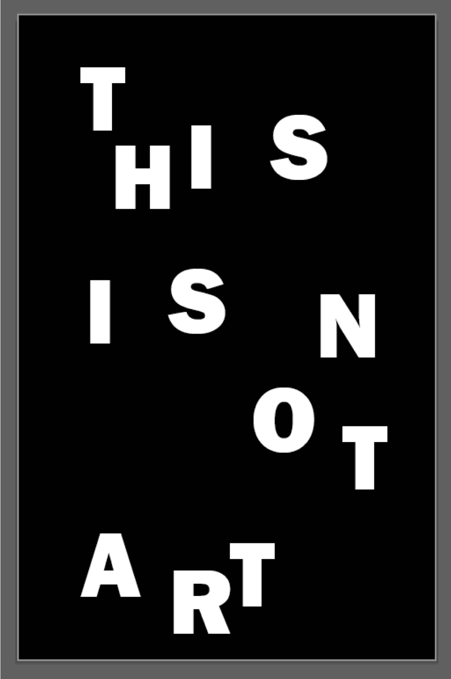

Based on the former exploration, I advised the group to brainstorm some ideas on installations on these themes, and we furtherly developed those creative ideas and made drafts on the duality of design (beauty and ugliness, for instance), the categorization of judgement, and so on.
Aidan:
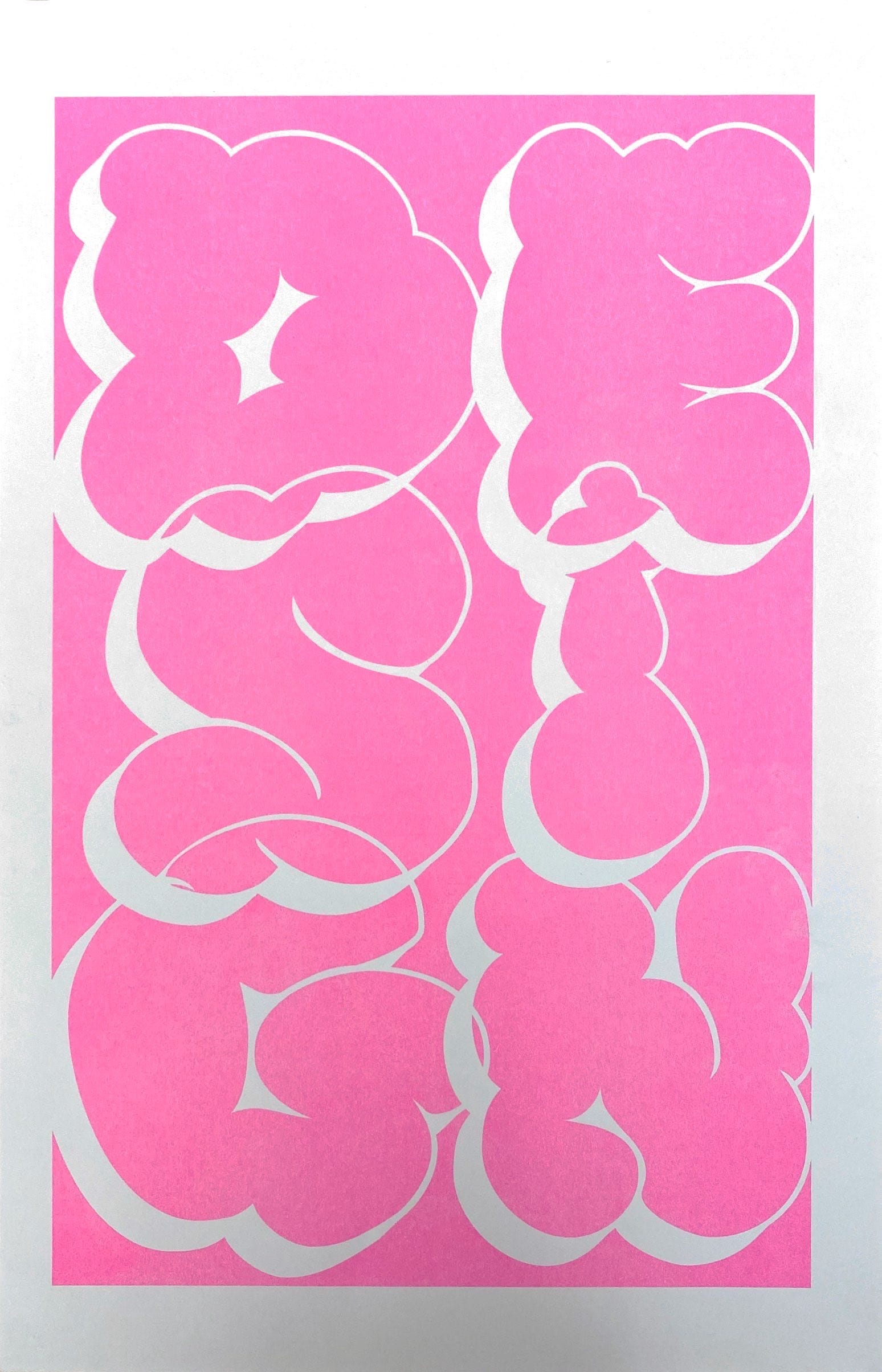
After doing the readings, I really started to think about what I like about design and where that overlaps with what other people think design is and what design should be. As I processed that I realized that my definition of design is much different than that of other people that I know and have studied and learned from. I created posters based on these questions that I came up with about the definition of design, and I noticed many underlying themes throughout them.

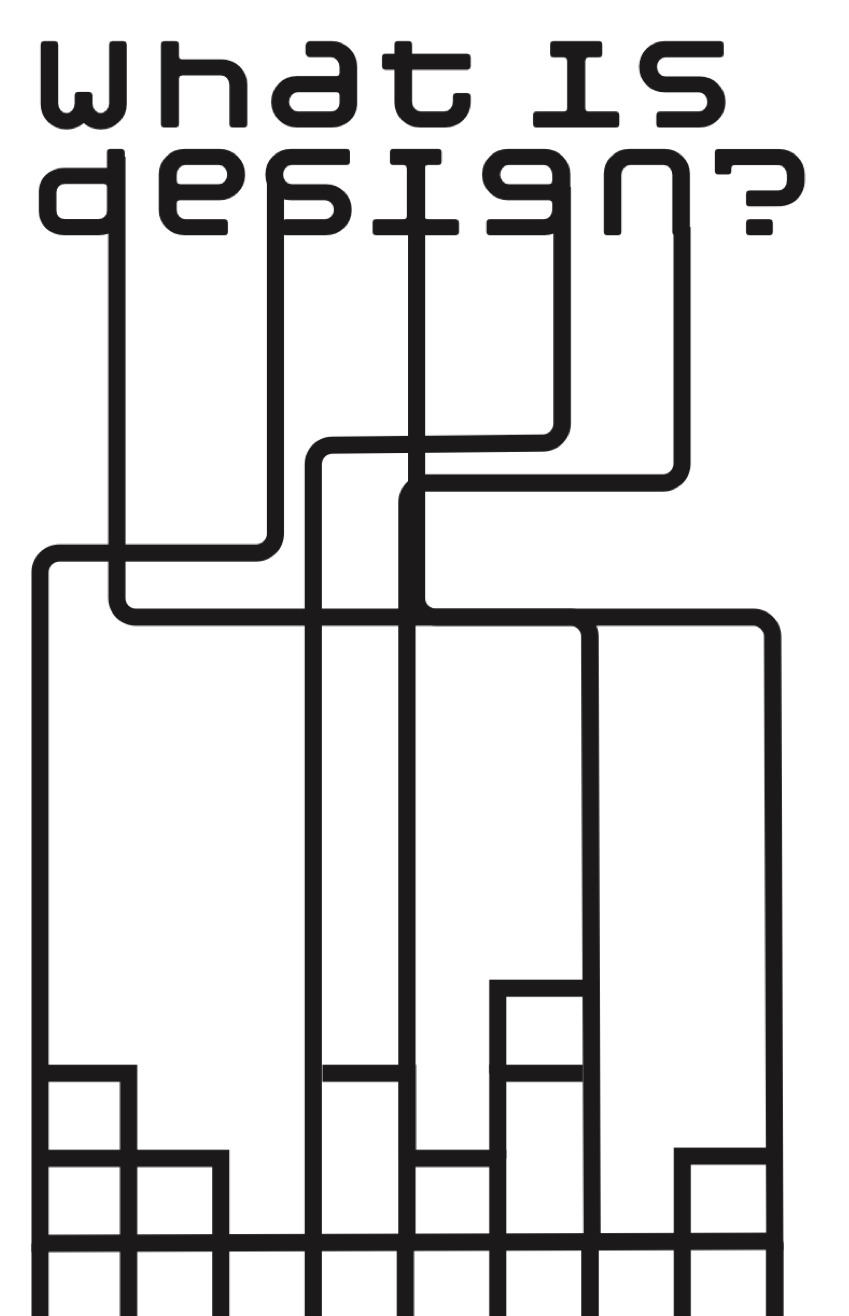


As me and my group discussed our own research and iterations, we found threads that went through all of our topics despite the diversity of our creation. We eventually settled on that diversity is the real strength of our team and our designs and wanted to find a way to incorporate that throughout our installation. This is a theme that I brought into my individual posters as I tried to use multiple ways of creating throughout each poster.
Sissi:
I started with 25 questions after reading all the articles and started to focus on the relationship between design and other art forms, including film, theater and music. After doing more research, I found that all of the art forms mentioned above tend to have a poster designed to promote them.


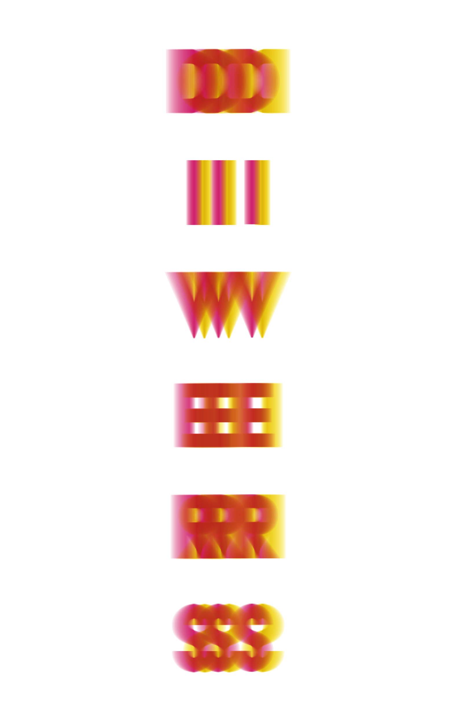
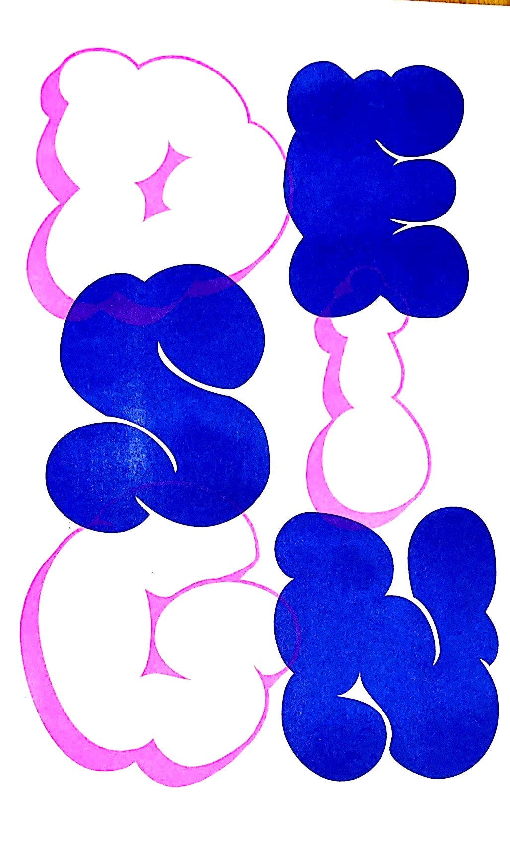
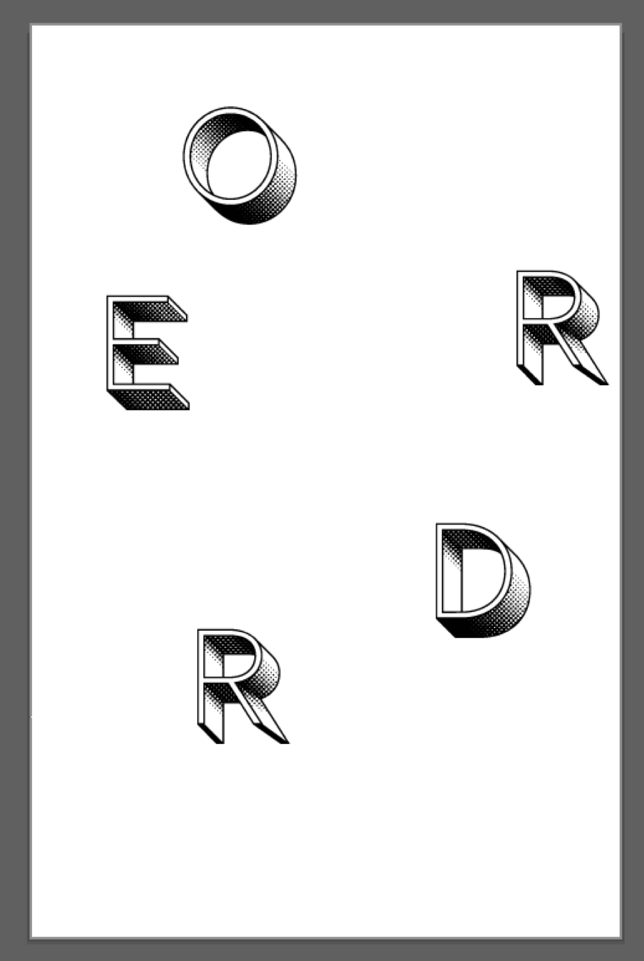
Therefore, I created 26 posters inspired by a lot of movie and music posters. In addition, I played with words and turned them into forms.




After talking to my group, we decided to create a system of different design directions. How do you define beauty? What design is ugly? With these two questions, we came up with an idea of a wired sculpture with the word beauty on the outside, and ugly on the inside. However, this idea was too literal and couldn’t get people thinking.
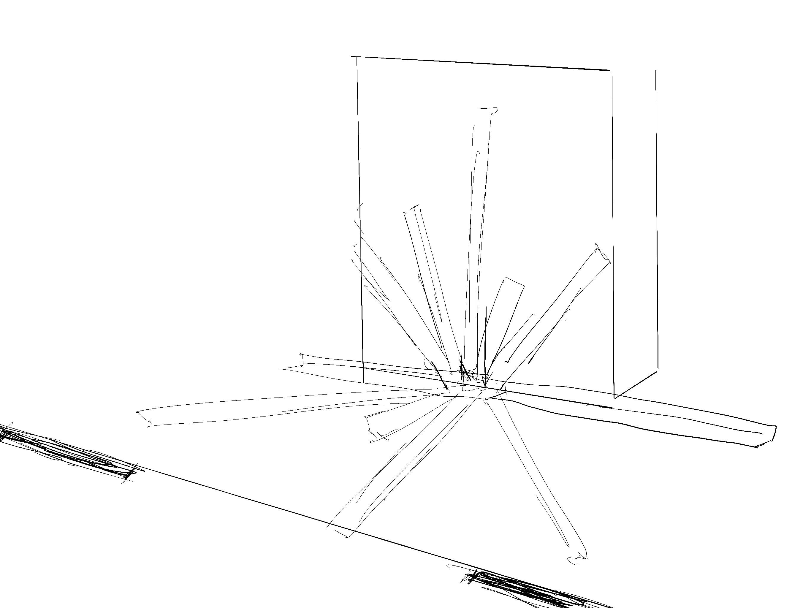
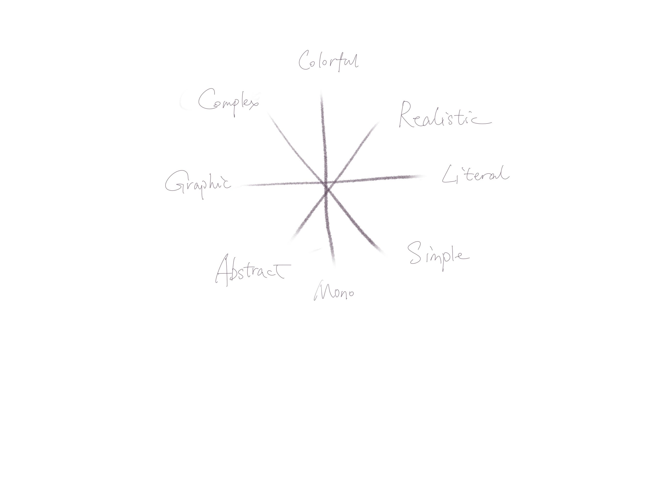
As we discussed more and kept polishing our idea, we came up with our final idea of creating a system with four axes and eight directions.


Idea combination:
After 100 questions in total came out, we collected all the questions into a Google Docs and gathered our concerns. Among all the questions, we figured out that all of us came up with the similar questions below:
Who defines what art is?
What is beautiful and what is not?
What are the criteria for criticism?
Is there a universal requirement for good art?
Based on these similarities, we decided to plan on setting up an installation about the various standards of criticizing art and design. We believe that even artworks have contradictory identities, they can both be good from different perspectives.
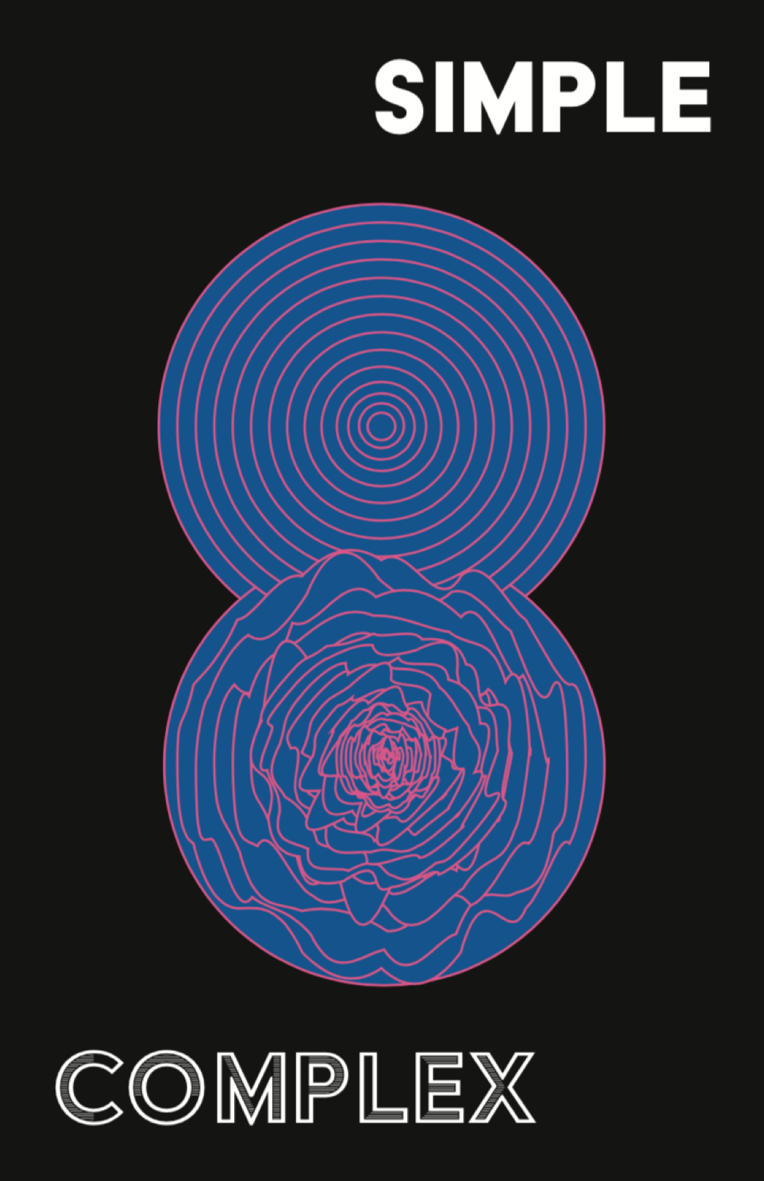
We firstly plan to set up a 12-side coordinate system with 6 pairs of antonyms, and later simplify to 4 pairs, which are “complex v.s. simple,” “colorful v.s. monochrome,” “realistic v.s. abstract,” “graphic v.s. Informational,” and design our works based on these coordinates. Each of the design pieces could have completely opposite styles with each other, which helped more on building up the entirety of the system.
Printing Process:
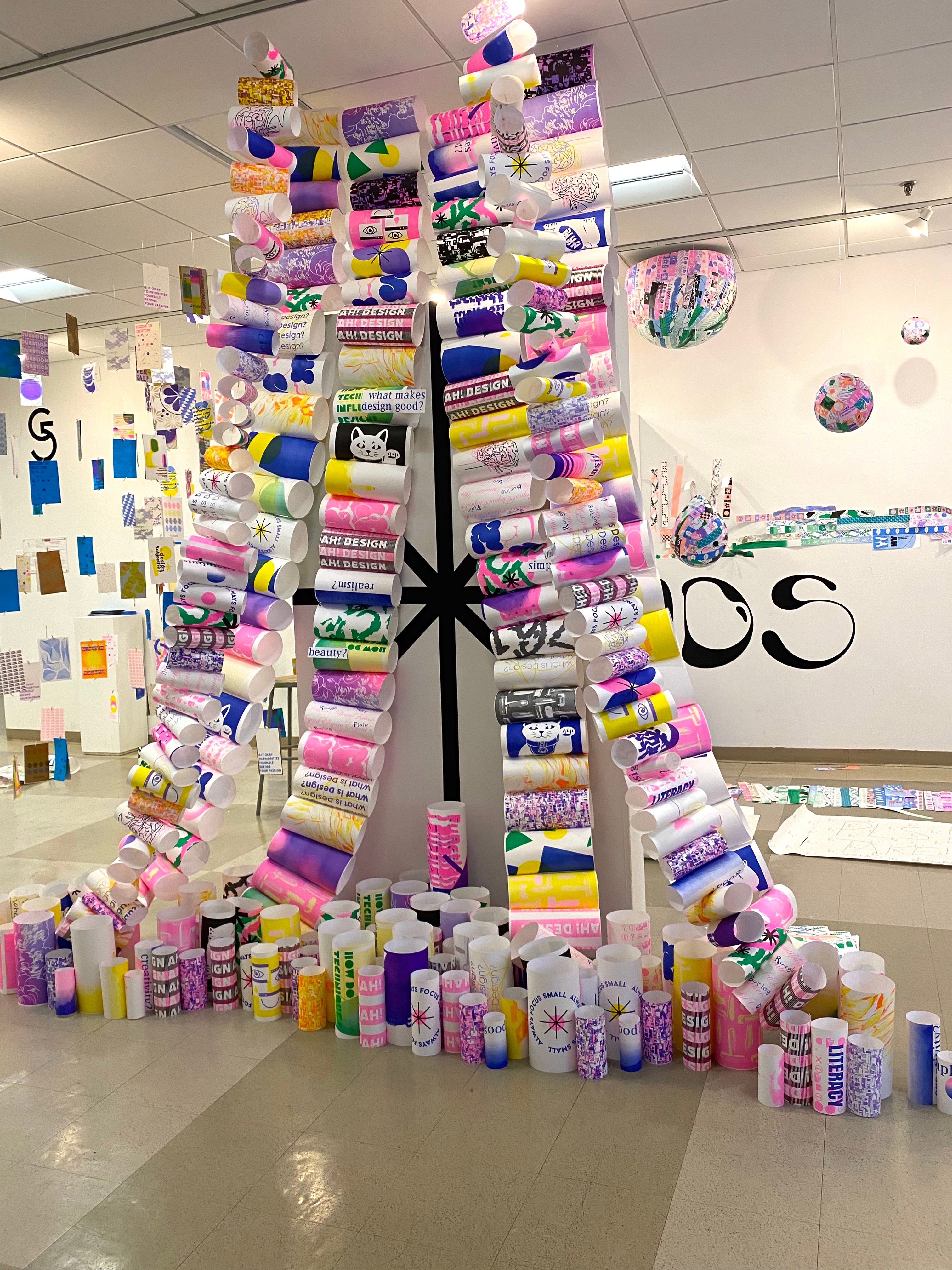
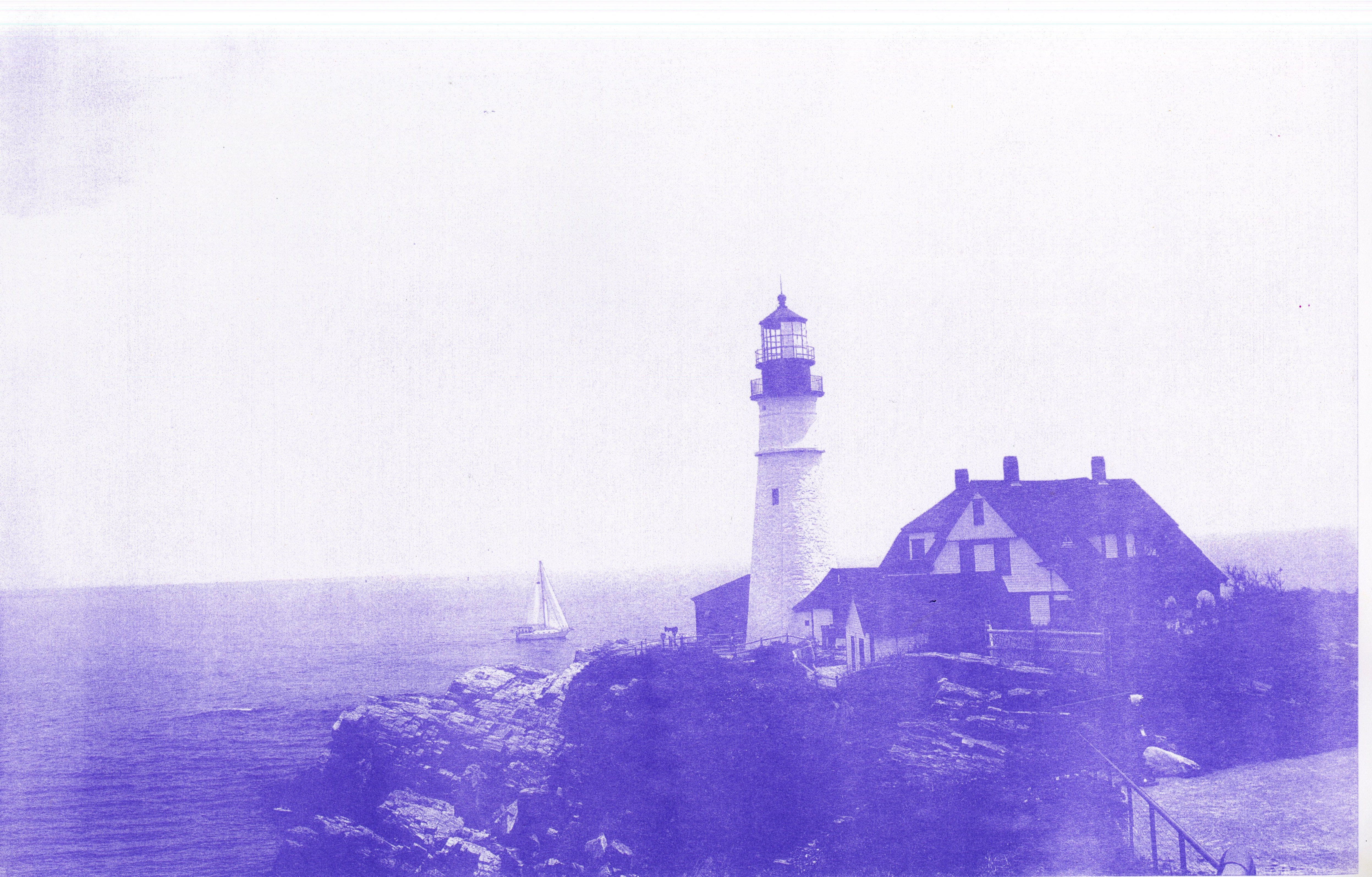
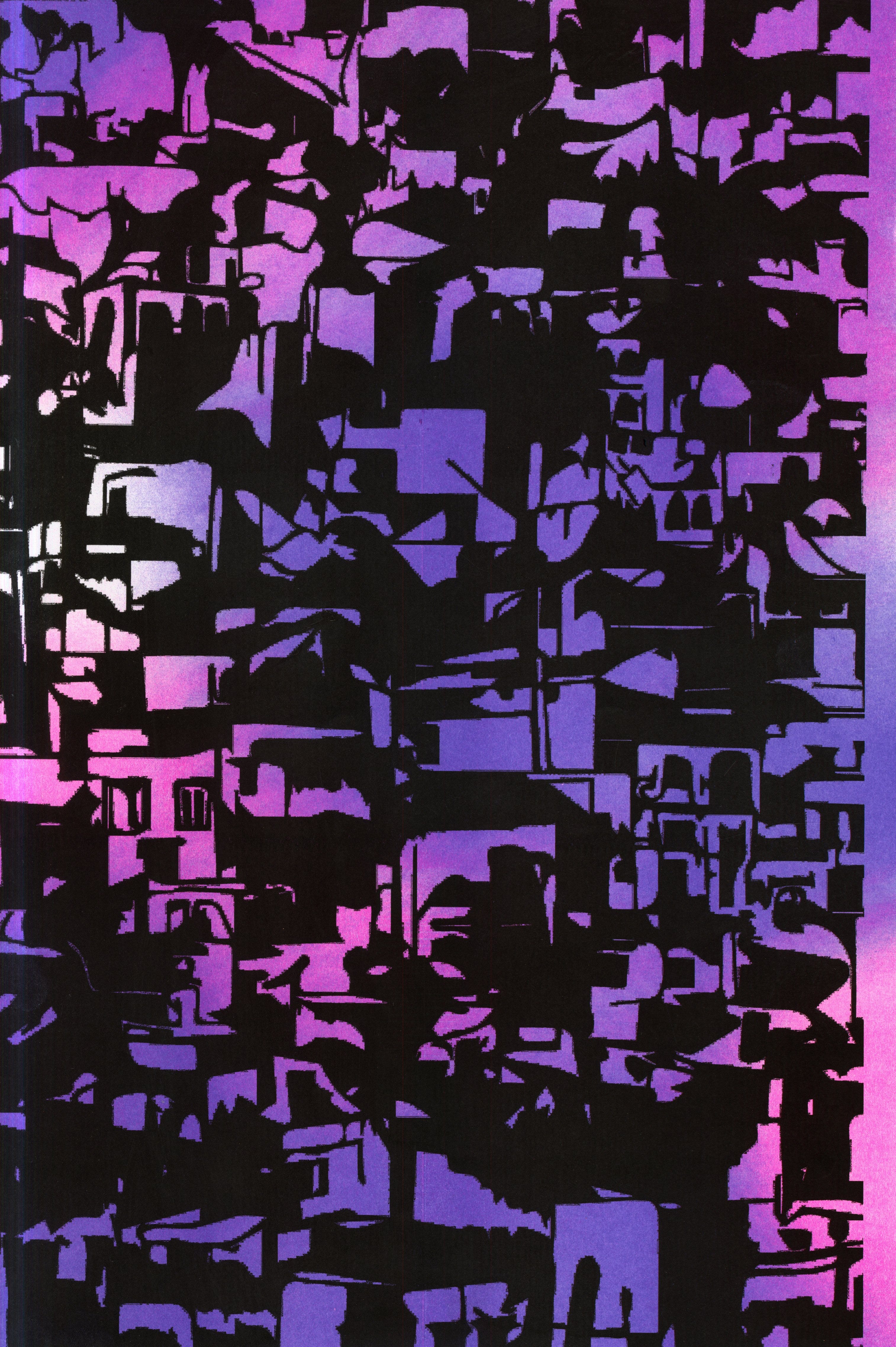
For the riso printing, we mainly use light-weighted paper to make sure the posters can easily be hung from the ceiling using the fishing wire. Our original forms of the posters include various kinds: photography, typography, illustration, and abstract shapes. We use these different kinds of posters to fit with our coordinate system. Our choice of color is based on the topic. We have a bold black axis in the back, and we wish our posters could also be bold and stand out in the front. Additionally, we wish our exhibition could be relatively connected with other exhibitions in the class. Therefore we decided to use fluorescent pink, medium blue, green, purple, yellow, and black as our overall color system.


Final Installation:
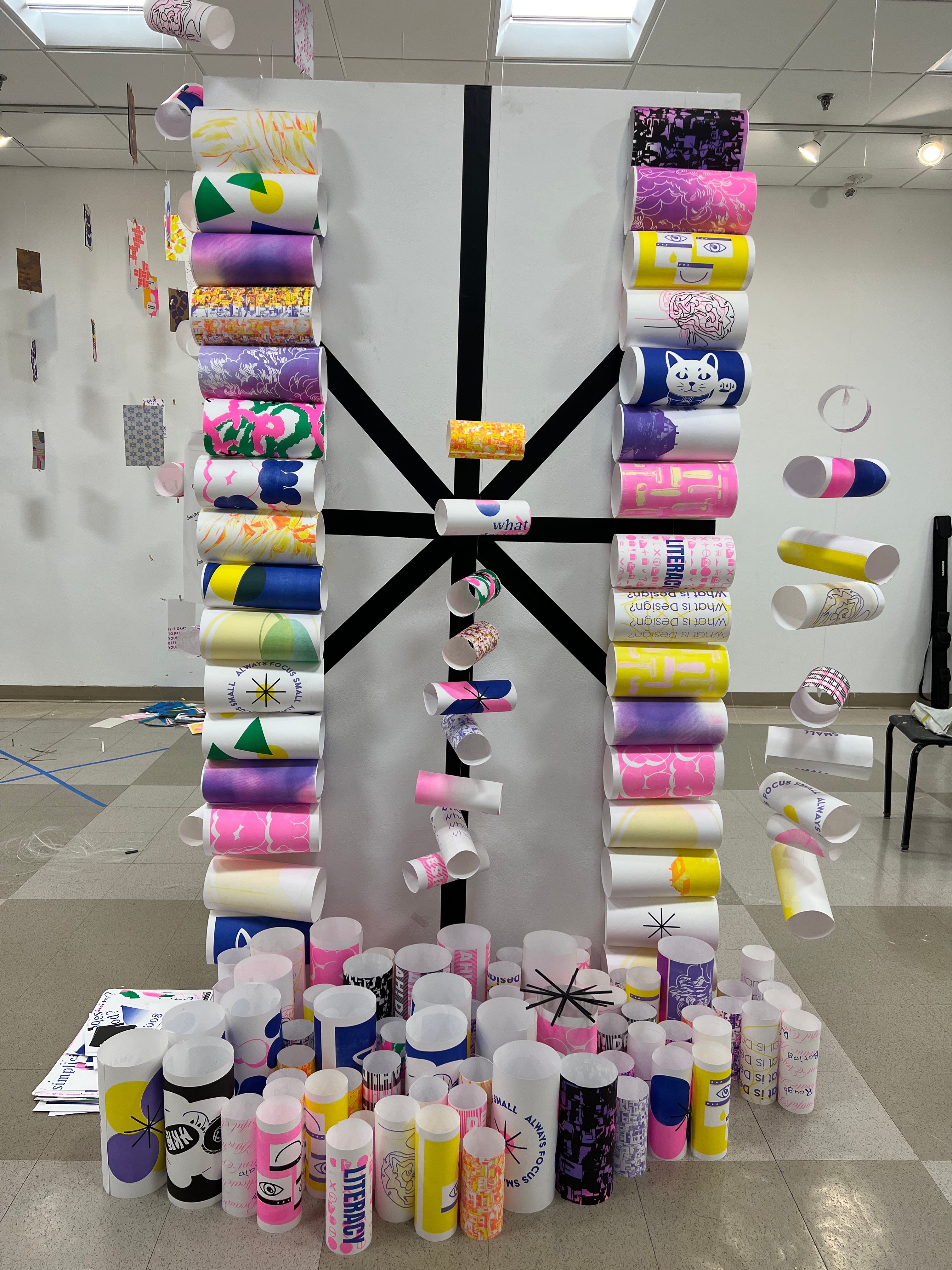
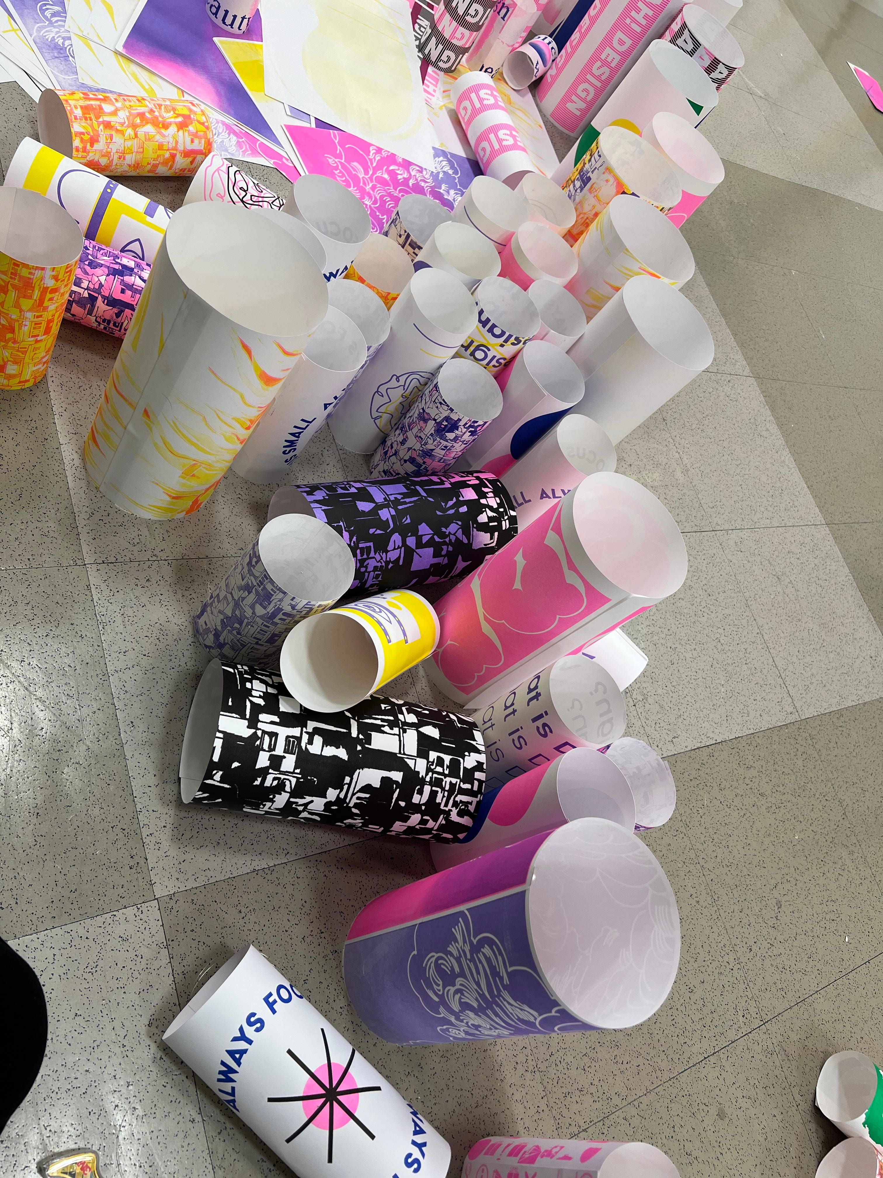
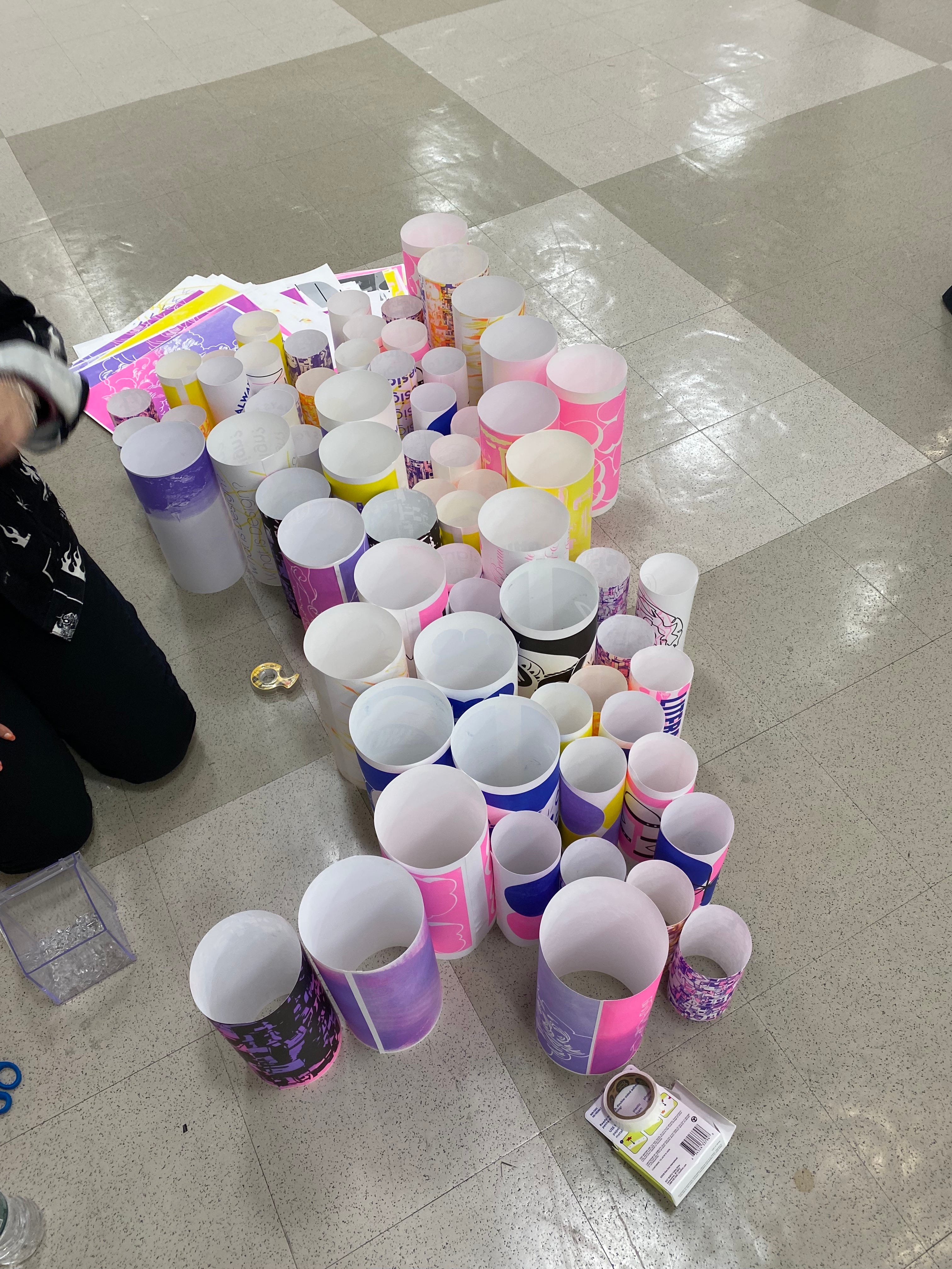
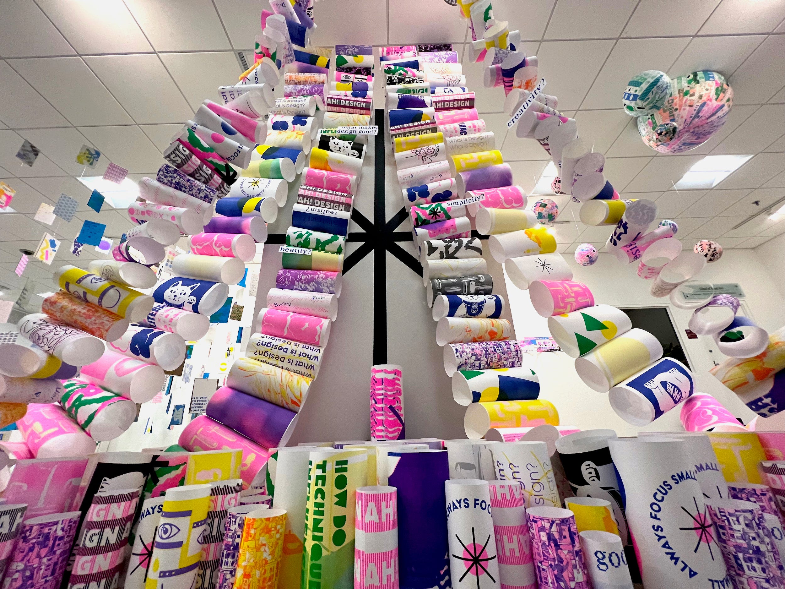
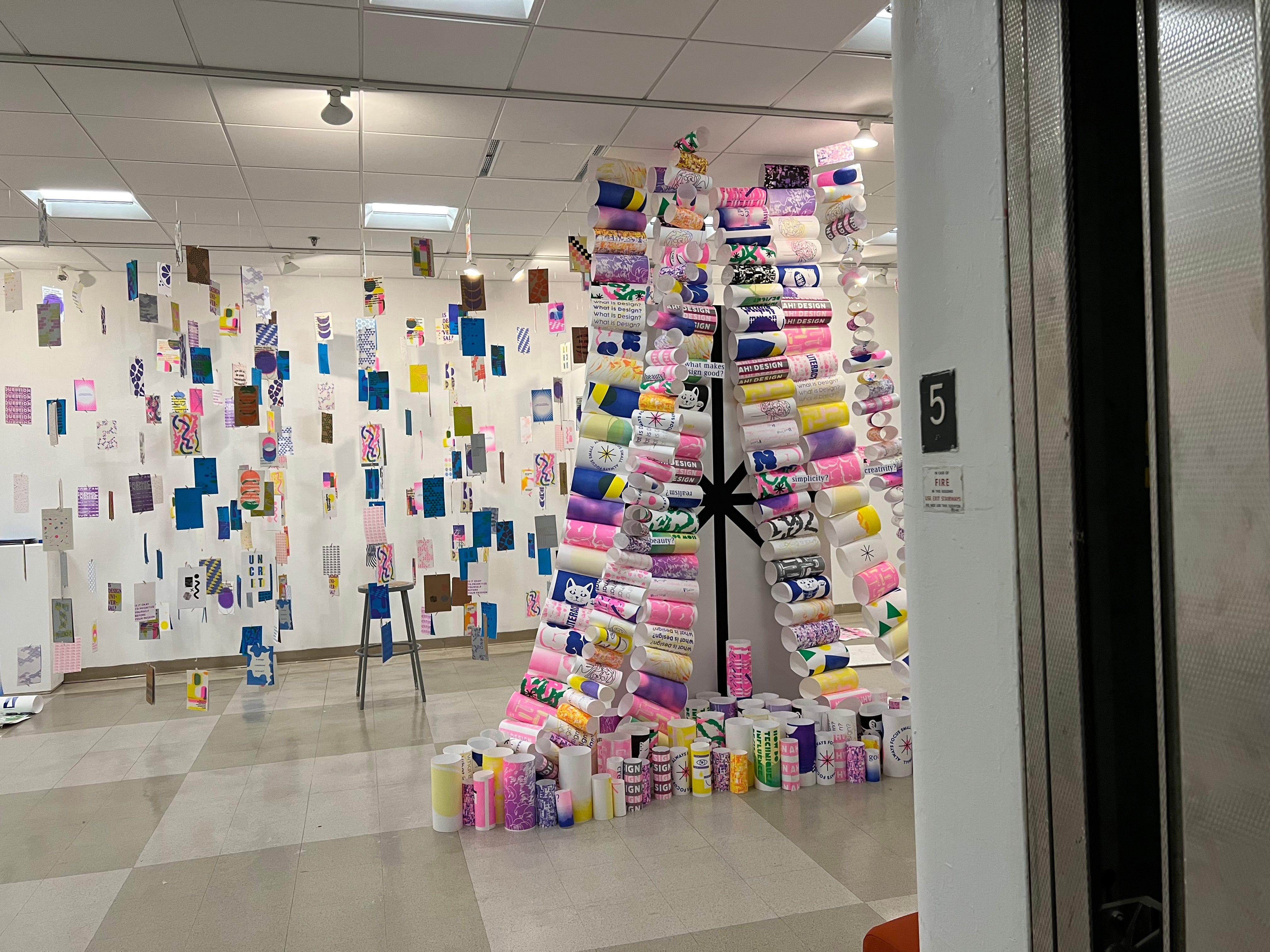
In our final installation, we went with a “fluid” idea. We rolled up every poster to add more dimension, and linked them up with fishing wire. We extended the chain all the way up to the ceiling to make the viewers’ vision reach all the way to the ceiling and lead to other team’s projects. We made our eight axis with black vinyl to contrast from our colorful riso prints. In order to reveal the axis, we have the riso chain drift to two sides, creating a current like form. This current form flows with the theme, and invites people into our class show at the entrance.

